Site.pro
  • AI Website Builder
    • AI Website Builder
    • Prices
    • Online Stores
    • Collaboration
    • Website Import
    • Plugins
    • Website Builder
    • Templates
    • For Design Studios
    • Useful Links
    • Affiliate Program
    • We Build for You
    • Examples
    • Languages
  • Domains
    • Register Domain Name
    • Migrate Domains
    • For Domain Investors
    • Domain Zones
    • Domainity
    • FAQ: Domains
    • Popular Domain Zones
    • .co
    • .com
    • .net
    • .org
    • .us
  • Email
  • Accounting Software
    • Accounting Software
    • Modules
    • Prices
    • Integrations, API
    • Accounting companies (368)
    • Software integrators (52)
    • Affiliate Partners
    • Useful Links
    • Business Types
    • Use Cases
    • Accounting companies
    • Sole Proprietor
    • Invoicing
    • Farmer
    • E-commerce
  • For Resellers
    • Prices
    • White Label
    • Revenue Share
    • Panels
    • How it Works
    • Marketing Materials
    • Mass Import
    • Our Partners
    • Reselling Examples
    • Documentation
    • Free Websites
  • Learn
    • Knowledge Base
    • Tutorials
    • Blog
    • Growth Hacking
    • For Hostings
    • For Education
    • Accounting: Start of Work
    • Teaching Institutions (68)
    • Accounting Courses Worldwide
  • AI Website Builder
    • AI Website BuilderAI creates websites for you
    • PricesAdvanced Features
    • Online StoresBuild online stores
    • CollaborationCo-create websites live
    • Website ImportImport Any Website
    • PluginsBuilder plugin and functions
    • Website BuilderKey Features
    • Templates200+ Awesome Templates
    • For Design StudiosBenefits for Design Studios
    • Useful Links
    • Affiliate Program
    • We Build for You
    • Examples
    • Languages
  • Domains
    • Register Domain NameDomain registration, parking, transfer
    • Migrate DomainsTransfer. Connect. Renew
    • For Domain InvestorsDiscount on all domains
    • Domain ZonesBuy New Domain Name
    • DomainityDomain usage by country
    • FAQ: DomainsFind Answer
    • Popular Domain Zones
    • .co
    • .com
    • .net
    • .org
    • .us
  • Email
  • Accounting Software
    • Accounting SoftwareCloud based ERP
    • ModulesMain accounting software modules
    • Prices30 days free trial
    • Integrations, APIIntegration with external systems
    • Accounting companies (368)Choose your partner for accounting
    • Software integrators (52)Pick your integrations partner
    • Affiliate PartnersPartners and Affiliate program
    • Useful LinksCalculators and Calendars
    • Business TypesUse Cases
    • Use Cases
    • Accounting companies
    • Sole Proprietor
    • Invoicing
    • Farmer
    • E-commerce
  • For ResellersWhite Label
    • PricesRevenue Share. White Label
    • White LabelCustomise Builder
    • Revenue ShareEarn 50% from each upgrade
    • PanelsOne product for all platforms
    • How it WorksCloud or On-Premises
    • Marketing MaterialsVideo. Mockups. Blocks
    • Mass Import
    • Our Partners
    • Reselling Examples
    • Documentation
    • Free Websites
  • Learn
    • Knowledge BaseFAQ: Builder, Accounting
    • TutorialsDownload for free
    • BlogSite.pro Blog
    • Growth HackingBoost your sales
    • For HostingsTips on marketing
    • For EducationTraining. Tutorials
    • Accounting: Start of Work
    • Teaching Institutions (68)
    • Accounting Courses Worldwide
  • Register
    By registering, you accept our Terms of Service
  • Log in

    Log in

    New user? Create account
    Forgot password?
  • $
  • English

How to Strategically Use Colours in Your Website Design: an Ultimate Guide

How to Strategically Use Colour in Your Website Design: an Ultimate Guide
Blog: Web Design Education

What is one of the most essential aspects of how we perceive the world? Surely it must be colour. But careful selection of colours for your website isn't only a matter of aesthetics. Colours can create associations, convey meanings, and just set the overall mode. That's why when it comes to the usage of colours on the web, the power colours can have on the success of your website shouldn't be underestimated.

Sources claim that colour enhances brand recognition by almost 80%! This, in turn, improves confidence in your brand, which is especially important if you are planning to build online stores. Through the right selection of colours, you can add a unique charm to your website while simultaneously improving user experience, appealing to their senses.

To help you achieve this, we've put together a guide dedicated to colour usage on the web. We'll take a look at what colour theory, types of colours, and colour palettes. While none of these rules are dogmatic, knowing some of the main principles of how colours work on the web is a good place to start if you are looking to create impactful and effective websites for your clients.

1. The Colour Theory

Colour theory is a set of fundamental principles that govern how to create harmonious colour combinations, as well as logical structures between colours. Understanding these principles is an important first step in ensuring that you are creating effective colour palettes for your brand and websites.

The colour wheel

A great way to understand the fundamentals of colour theory is through studying the colour wheel. Now, even if you are as far as design as possible, there’s still a large chance you’ve seen a colour wheel in one form or another.

So, what is it exactly? Created in the 17th century by none other than Sir Isaac Newton, colour wheel is the colour spectrum mapped into a circle. You can think of it as a geometrical representation of colours, with hues arranged according to their wavelength, emphasizing the relationship between primary, secondary, and tertiary colours.

The Colour Wheel

Fast forward to today, the colour wheel has waived its way into the life of artists, developers, and designers, and helps them to find harmonious and beautiful colour combinations for their creations. It’s a versatile tool with many variations of understanding which might take some time. To make it simpler, for the purpose of this article, we’ll take a look at primary, secondary, and tertiary colours, as well as tints, shades, and tones.

Primary colours

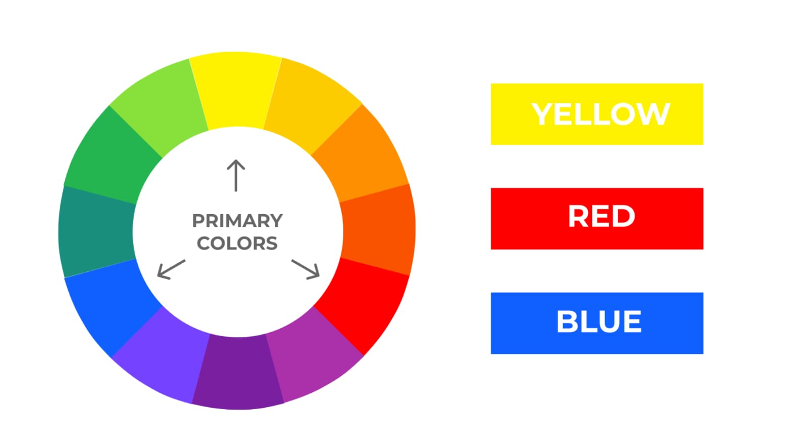
There are three primary colours in the colour wheel: red, yellow, and blue. You can then combine the primary colours together to form secondary colours.

Primary Colours

Secondary colours

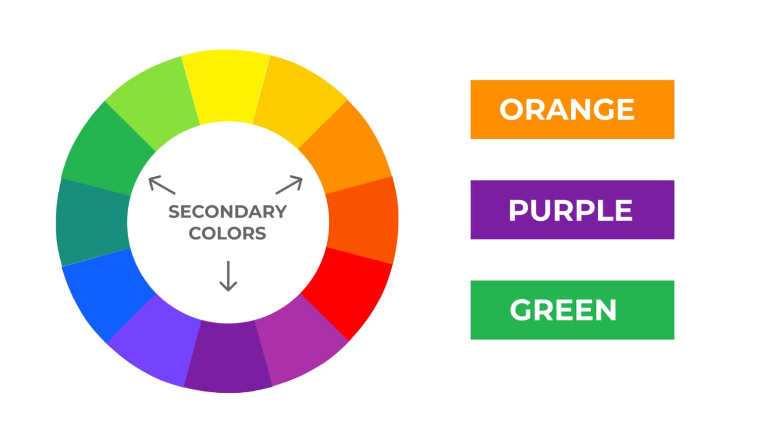
On the colour wheel, there are also three secondary colours. These colours are purple (red + blue), green (blue + yellow), and orange (red + yellow). By combining secondary colours with primary colours, we get the tertiary colours.

Secondary Colours

Tertiary colours

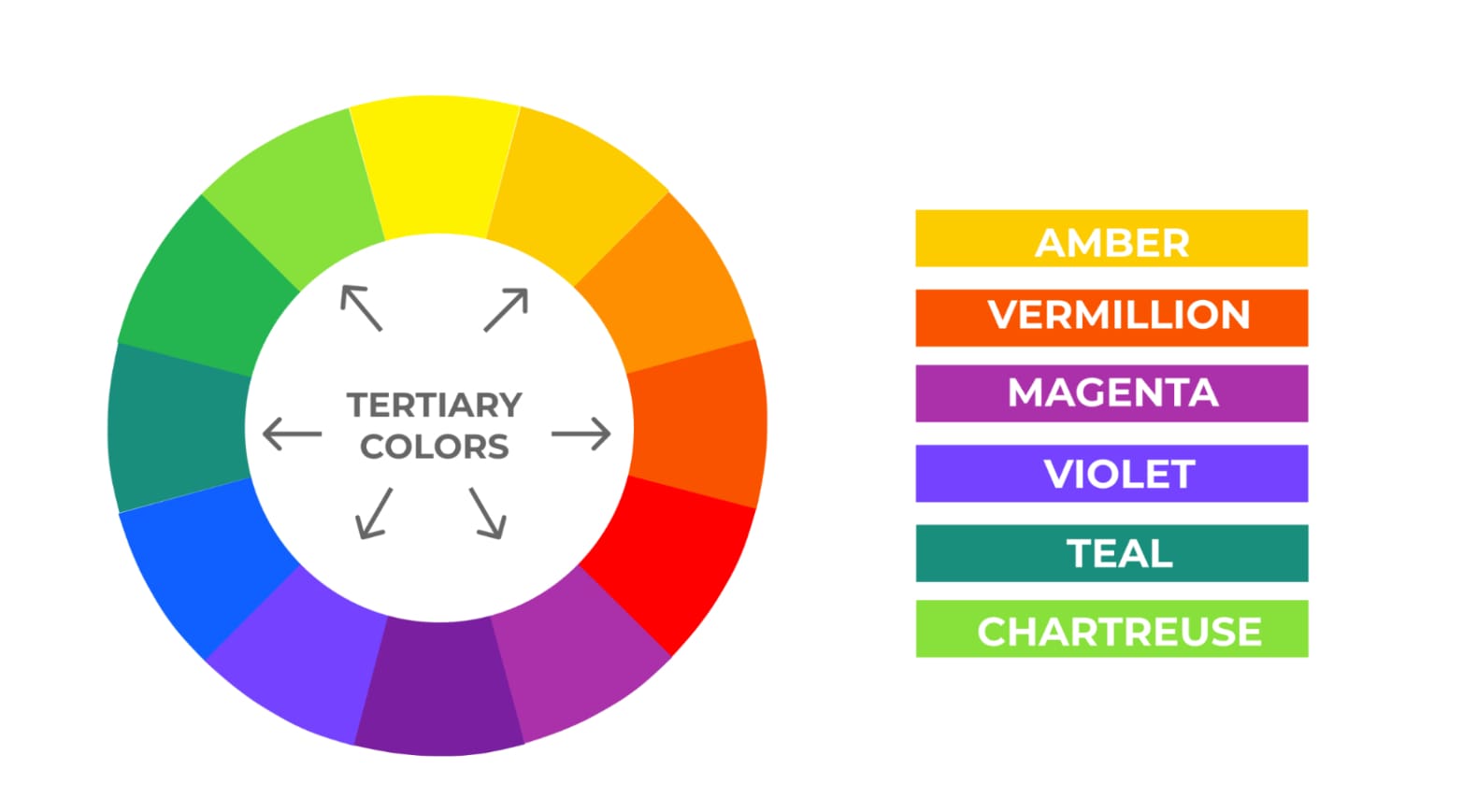
As mentioned, the tertiary colours on the colour wheel are a result of combining the primary and secondary colours (i.e. yellow-orange, blue-green, and more).

Tertiary Colours

Tints, shades, and tones

Primary, secondary, and tertiary colours are considered as pure colours, known also as hues. They stand out as bright, vivid, and cheerful. And they also are the base of tints, shades, and tones.

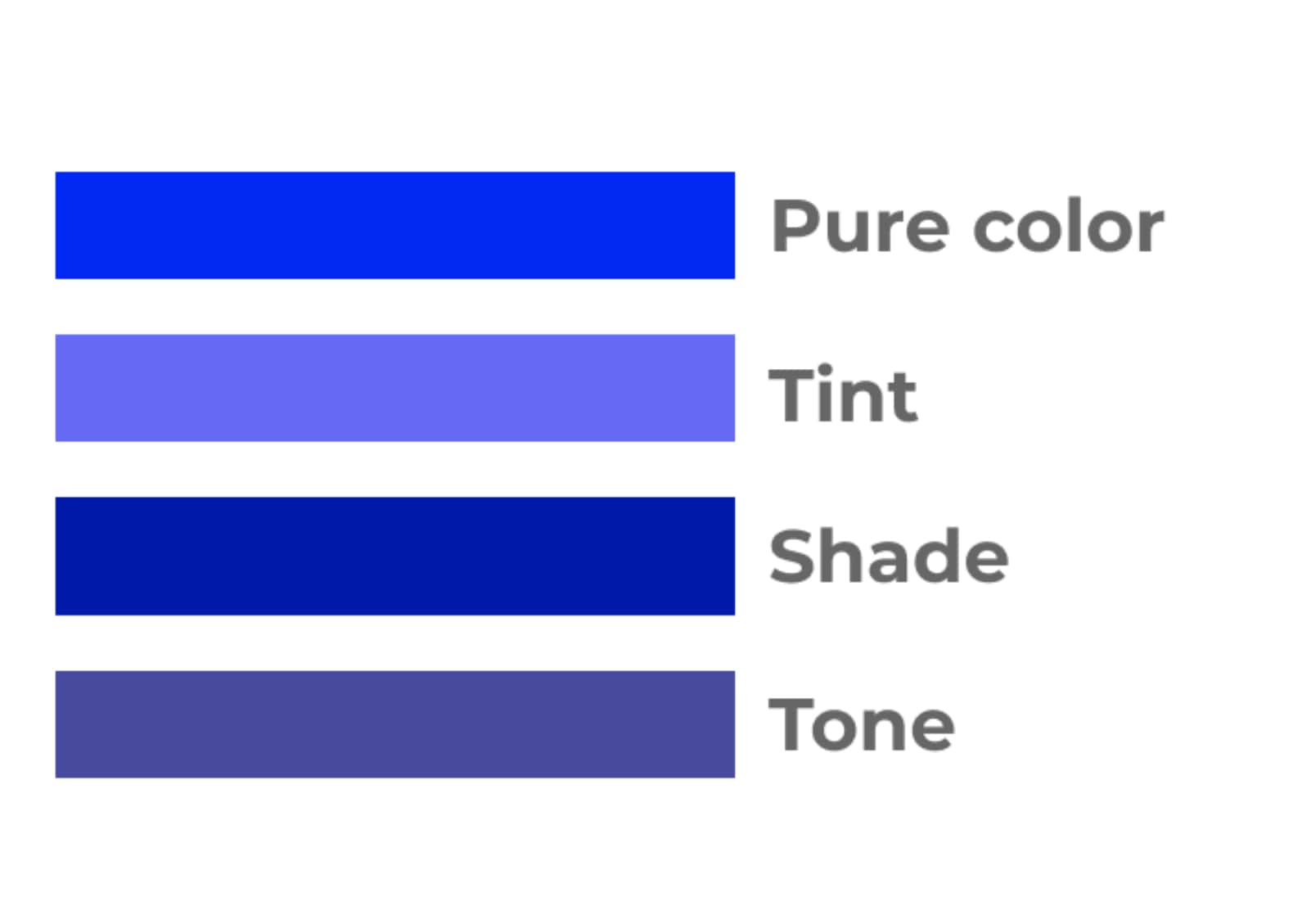
Example of Tint, Shade, and Tone

Tints — Tints are the combination of pure colours with white, resulting in lighter colours.
Shades — Shades are created when adding black to pure colours, creating darker versions of hunes.
Tones — Tones are the mixture of hues with gray (black+white), offering a more subdued version of pure colours.

2. The Cultural Context

Although different colours have different meanings and associations for each of us, many of them also have a deep-rooted cultural significance. For example, the colour red in Western society represents danger, among other things. You've also probably seen this online, in case of, for example, "Cancel" buttons or other types of errors. In Eastern societies, however, red represents luck and isn't used in the context of danger. In Malaysia, for example, green is used as the colour to indicate dangerous situations. A little bit further, in Japan, green is the colour indicating love.

All this to say that when choosing colours for your website, keep in mind that context is critical. Depending on the countries that you are targeting, and the content of your message, the colours you use can be interpreted differently, sending out a message different from the one you intended.

Luckily, this is not so hard: a simple Google search and a little bit of reading about the cultural background of your target market should do the trick. And if you are going global, or intend to cover significant territories, avoid using colours with cultural significance altogether. The meanings we give to colours are deeply ingrained and can create positive or negative connotations, even without people realizing it.

There are certain exceptions, of course. Big brands are often so associated with their colours, that this brand perception overshadows any potential negative feelings that may arise.

3. The Colour Palette

Now that you have a better understanding of colour theory, let's take a look at how you can create an intentional colour palette for your website.

The colour you choose first should be the primary colour of your brand, not to be confused with the primary colours on the colour wheel. The primary colour is also used to describe the main colour of each palette, and it doesn't need to be red, yellow, or blue.

Now, this is where knowing colour psychology and understanding what effect colours have on people comes in handy. What do you want your visitors to feel when they land on your website? What should be their perception, and what actions should they take? You can use the below associations as a reference guide when making your colour palette.

  • Red: passion, power, love, danger, excitement;
  • Blue: calm, trust, reliability, peace, logic;
  • Green: health, nature, abundance, prosperity;
  • Yellow: happiness, optimism, creativity, friendliness;
  • Orange: fun, freedom, warmth, comfort, playfulness;
  • Purple: luxury, mystery, sophistication, loyalty, creativity;
  • Brown: nature, security, protection;
  • Black: elegance, power, sophistication, sadness;
  • White: clarity, purity, peace.

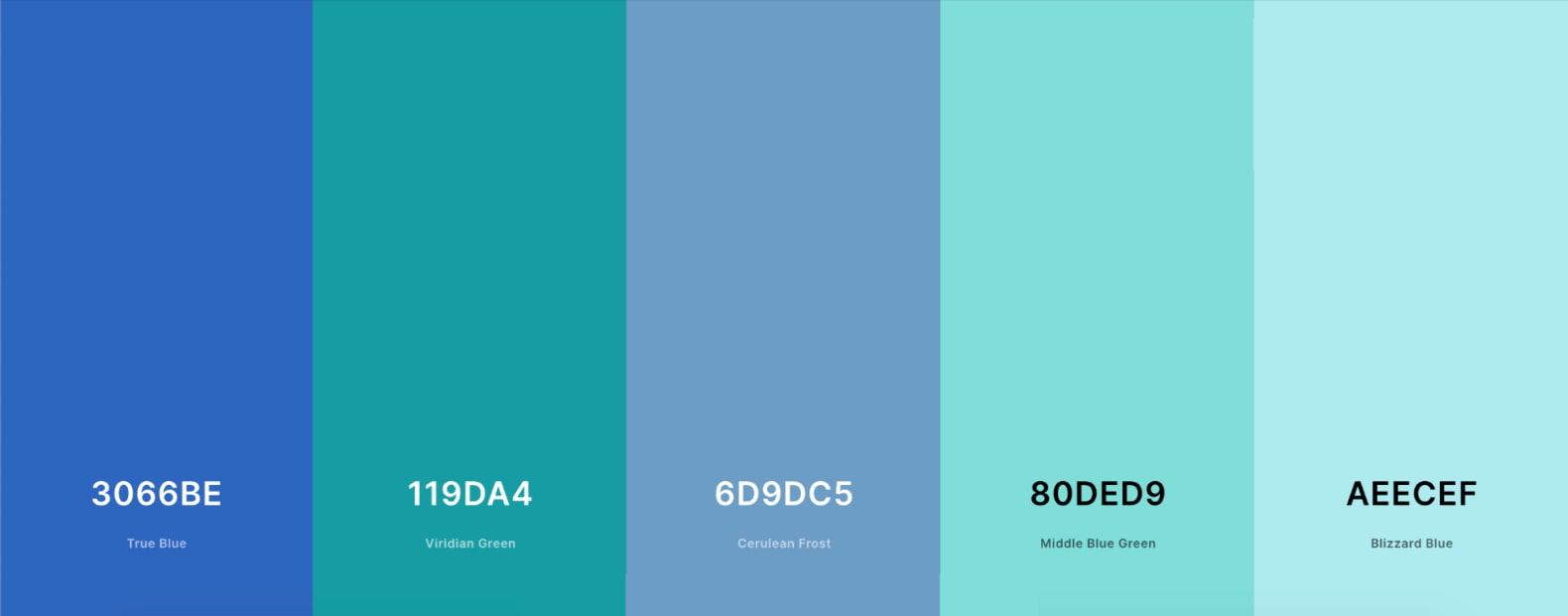
Example of a Colour PaletteMade by Coloors.co

Colour palette types

There are five main types of colour palettes: analogous, monochromatic, triad, and complementary. Any of these can be used to create an effective colour palette for a website. Below we'll look at some examples of how each of these colour palette types are used in website design.

Analogous

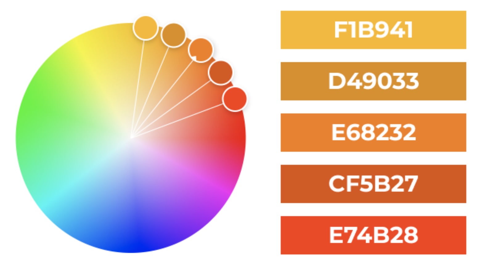
Analogous colours are colours that sit next to each other on the colour wheel. This type of palette can look very beautiful because the colours fit together so nicely. However, the effect could be too subtle, preventing any elements from standing out enough.

Analogous Colour Palette

Monochromatic

Monochromatic colour palettes are based on a single colour paired with various shades and tints. Like analogous palettes, monochromatic palettes can be very pleasing to look at. However, it's a good idea to add a complementary colour to a monochromatic palette in web design in order to draw attention to important elements.

Monochromatic Colour Palette

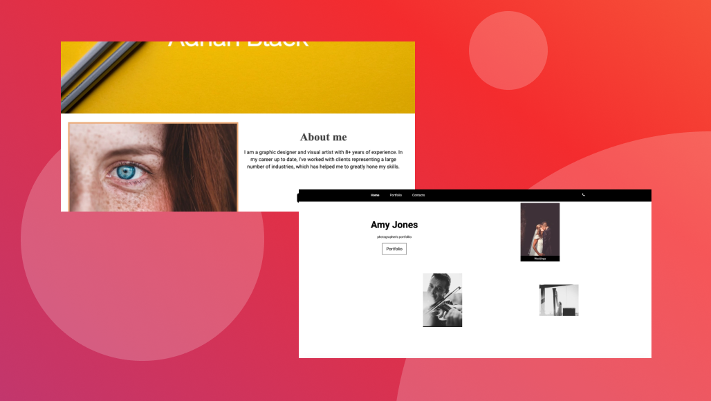
Here’s an example of a monochrome website, where black and are dominating. The background adds texture and depth to the website, while the colours draw our attention to what’s important.

Example of a monochrome website

Try this template

Triad

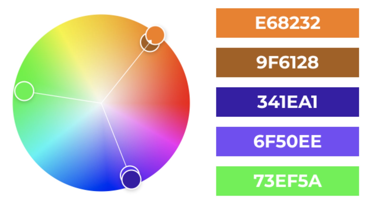
Triad colour palettes consist of three colours that are evenly spaced apart on the colour wheel, forming a triangle. This type of colour palette is a bit risky to use in website design because it can appear noisy. However, depending on context, triad colour palettes can be very effective for youthful, playful, and/or artistic brands.

Triad Colour Palette

Here’s an example of a bold usage of triad colour palette. Through a combination of web design elements and visuals, it’s attention grabbing and bold, but not too over the top, emphasizing what’s important.

Example of usage of triad colour palette

Try this template

Complementary

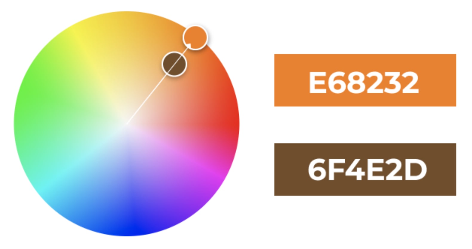
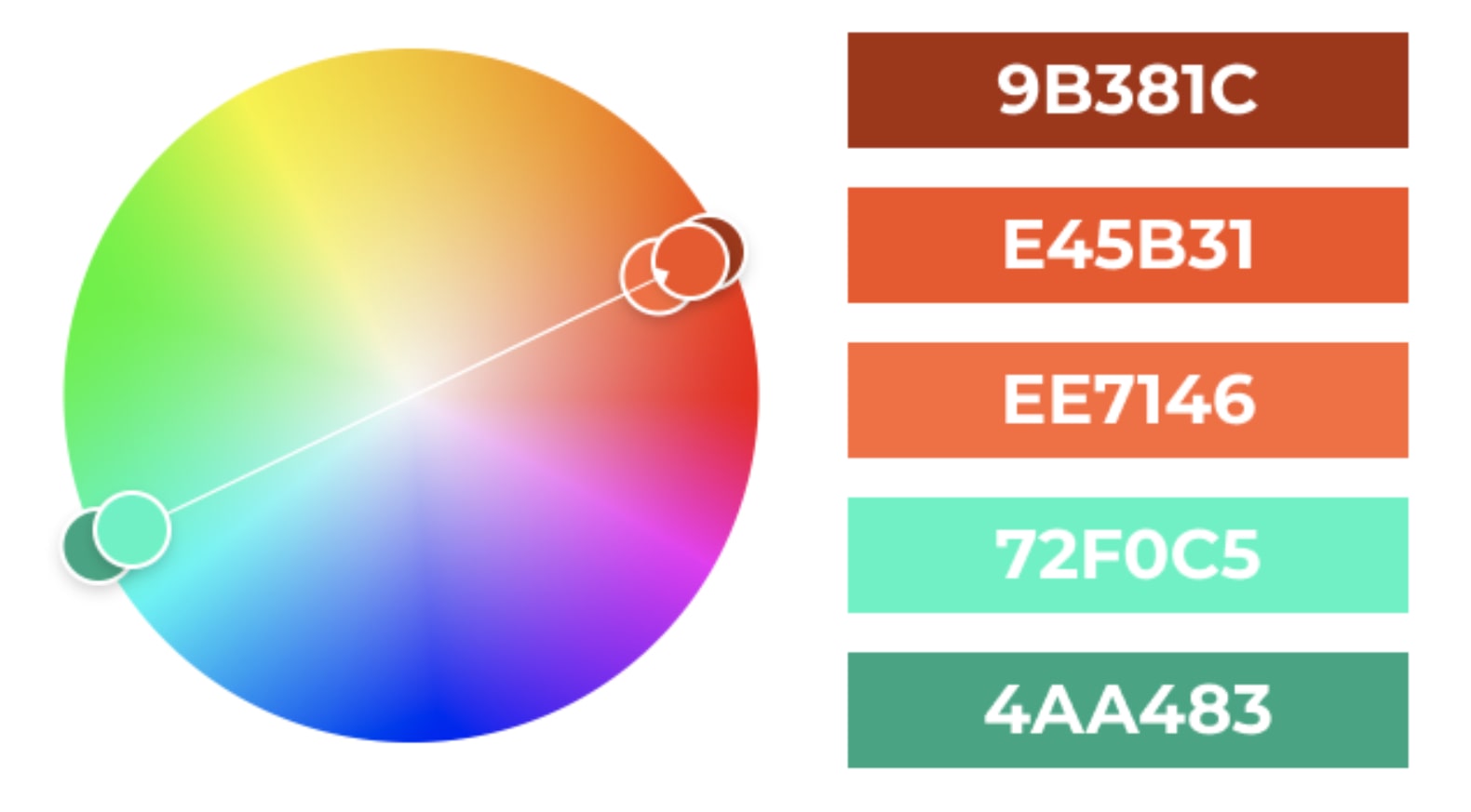
Complementary colour palettes contain colours on opposite ends of the colour wheel. These palettes are very effective for web design because they create visual balance and tension. If the colours are used equally however, the tension can be too high. Instead, choose one of the complementary colours as the primary brand colour, and use the other as an accent colour.

Complementary colour palette

Using colour palettes in your website design

There are many tools online that you can use to aid the process of creating colour palettes on your website. Adobe Colour is one of the more popular and versatile ones. You can use it to play around with the colour wheel, experimenting with different colour combinations and all five palette types discussed above. And if you need a little bit of inspiration, you can use the Explore option to browse through thousands of available palettes.

When creating a colour palette for your website design, a good rule is to start with choosing three colours: a primary colour, a secondary colour, and an accent colour. Once you found the perfect colour combination, apply it to your website design using the 60/30/10 rule, where 60% of the time the primary colour is used, while the second is used 30%, and the accent colour 10% of the time. Adding more may distract visitors from the main actions you want them to take.

Wrapping Up

In this article, we covered the basics of colour theory and how you can use them to create high-value and impactful websites. While colour is a tricky tool to master, it's also an inseparable part of a highly functioning website. We hope that the tips and rules discussed above will help set a good foundation as you start the process of your website design. Good luck!

Previous
A Beginner’s Guide to Website Composition Principles
Next
How to Craft the Perfect Website Roadmap? A Step-By-Step Guide
© Site.pro 2011. Website Builder. United States.
Contact SalesTerms of ServicePrivacy Policy